Tagged With ‘slab serif’
Knize
Knize Ten
8 May, 2015

The year 1924 was a great one for perfume, if only because it saw the launch of both Chanel’s sumptuous Cuir de Russie and this, the wonderful Knize Ten. That both have survived into the present day is a bit of a miracle, but though they’re both usually placed in the ‘leather’ category of fragrances, they could hardly be less similar.
Cuir de Russie is a wonderfully rich and complex perfume, but its oddly androgynous combination of smoke and leather with a heavy floral note can make it rather difficult to wear. Knize Ten is a much more immediately appealing, fresher-smelling scent, and its leatheriness is tempered with the kind of zesty and herbal ingredients you’d expect to find in a classic eau-de-cologne – things like bergamot, lemon and geranium.
These gradually fade away on the skin, leaving a lovely, long-lasting but not overpowering leathery scent, less smoky than it is sweet. To me it also has a strong whiff of heliotrope – those electric-blue park bedding plants whose cherry-pie scent can be so intoxicating on a hot still high-summer’s day – but others may detect more than a hint (if I remember it right) of Plasticine; not unpleasant in itself, but enough to add a touch of childhood to the mix.
If Cuir de Russie is a testament to the genius of Ernest Beaux (whose greatest triumph was Chanel No 5), then Knize Ten is a fitting monument to François Coty (the mass-market perfume pioneer) and his brilliant technical director, Vincent Roubert (who had previously worked with Ernest Beaux in Grasse, then the perfume capital of France). It was commissioned, rather unusually, by a bespoke men’s tailoring company from Vienna, Knize, whose boutique is still going strong today. I’d wondered whether Knize Ten was the sole survivor of nine other fragrances, but it turns out that the name was dreamed up by their advertising director of the time, who beat Ralph Lauren by at least 50 years by seeking to associate the company with the aristocratic imagery of polo: the name ‘Ten’ was chosen to reflect the highest handicap in the game.
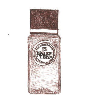
I love everything about Knize Ten: not just its instantly appealing smell but the smart glass bottle, with its crisply bevelled corners and chunky black cube of a cap. I’ve read somewhere that, like the company’s Viennese store, it was designed by the legendary Austrian architect Adolf Loos, and although that seems like wishful thinking it could be true; Loos designed further shops for Knize in Paris and Berlin, so their association was obviously close, and the dates look perfectly plausible too.
Even the typography of the label – a bold slab serif in a Victorian playbill style – is punchy and confident, just like the perfume inside. And while it’s far less widely available than it deserves to be, it’s not even that expensive by contemporary standards: what’s not to like?